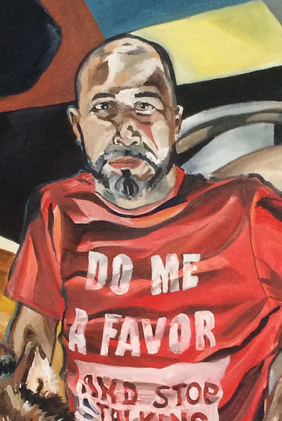
Cognizance of Color
Leaving the Transart Berlin residency was for me, like many others, like being taken into a vast forest, blindfolded, and left alone (not so much how to figure out how to get back—but to find a new way out of the woods).
“Keep doing what you are doing: repeat, repeat, repeat”, one advisor advised.
“Think about your choices and your process: emphasize time and performance” advised another.
“Your portraits are beautiful”, someone said, “but in two years, I do not want to see that”.
“That” referred to the body of work I showed at presentation in Berlin: portraits of people sitting patiently on my futon or a friend’s leather couch in bright colors. So my first step was to work through color; my palette needed to change. A classmate told me that my colors looked “straight out of the tube” and advised me to mix in greys with the colors on my palette.
When I returned home, I got straight to work. I read Josef Albers’ Interaction with Color and began experimenting.
According to Albers, when using a dark palette, the figure looks further away from the viewer. A light palette has the opposite effect. Before Transart Institute, I had painted my friend, author Toby Tompkins in a brown leather jacket. The portrait carried my usual trait of bright reds and yellows in the face and even the brown of the jacket pops. When I returned from Transart, I asked Toby to sit again and this time I used only dark colors mixed with grey. The difference is notable, I think.
Whereas the first portrait in the leather jacket is almost “pretty”, the grey-infused Toby portrait almost seems to have more “life” for its lack of vividness. Is this, then—the second portrait—closer to how we see people? Was I exaggerating the colors I was seeing in Toby’s previous portrait? If so, why? What was I attempting with the vivid colors? (style?).
Another question I have is, by pushing the colors back (by mixing them with grey), what effect am I achieving? I do like (almost prefer) the newer, grey-infused Toby portrait, but I am not quite certain why I feel it is better than the previous one with the bright colors.
Along with Toby, I also painted another friend, Bronx blogger and activist, Ed Garcia Conde. This time I used a light palette (to achieve Albers’ distance effect—not sure that worked) but also mixing greys into the colors. Below is another comparison. The first is the previous Ed portrait with vivid palette. The second uses bright colors but dulled with grey.
With both the Toby Tompkins new, grey-infused portrait and the Ed Garcia Conde new, grey-infused portrait, there seems to me to also be a shift in style that I cannot say I am cognitively aware of how or why it is happening; it’s almost as if the shift in palette has changed some other sensibilities, sense of aesthetics, sense of likeness, sense of translation of what I am seeing.
The final experiment is the portrait of Flavia that immediately follows this entry. For Flavia’s portrait, I first painted the entire canvas grey and worked over the grey. It was a struggle to manipulate the colors and “form her face” the way I would usually do with all the grey being mixed in. The result is, once again muted, But again, I see a shift in style that I cannot quite peg; as if the grey is forcing a different sense of sensibilities and sight in me.
“Flavia” oil on canvas
“Toby” in original bright palette
“Toby” in grey-infused palette
“Ed” in original bright palette
“Ed” in grey-infused paletter


